07/25/2024
Make a Lasting Impression with a Colorful Business Card Design
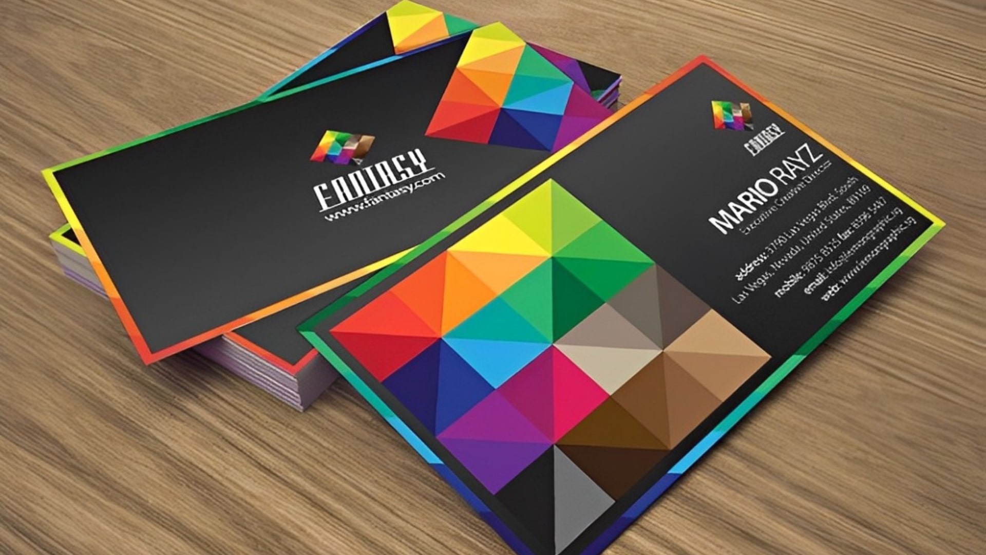
In the competitive business world, first impressions are crucial. One of the most effective ways to leave a lasting mark is by using a colorful business card design. While traditional white cards have their place, the rise in colorful business card printing shows a growing trend toward standing out and showcasing individuality.
Why Opt for Colorful Business Card Design?
1. Stand Out Effortlessly With Colorful Business Card
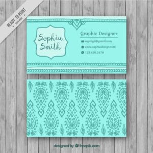
In a sea of plain white cards, colorful business cards grab attention instantly. They’re more likely to be remembered by potential clients or partners. Whether you choose a soft pastel or a bold, vibrant shade, the right color can set you apart from the competition and make your business card unforgettable.
2. Showcase Your Brand Identity
Colors are powerful branding tools. They evoke emotions and send messages without a single word. A well-chosen color for your business card can perfectly reflect your brand’s personality. For example, a tech company might go for sleek, modern colors like blue or silver, while a creative agency might lean toward bright, playful hues like orange or pink. Your color choice can instantly communicate your brand’s essence.
3. Improve Readability
A carefully selected background color can enhance the readability of your card. By choosing contrasting colors for the text and background, you ensure your contact information stands out. Classic combinations like white text on a dark background or black text on a light background are timeless and highly readable.
Tips for Effective Colorful Business Card Printing
1. Invest in Quality Materials
The impact of your colorful business card design isn’t just about color—it’s also about the quality of the card. High-quality card stock feels professional and substantial, making a stronger impression. A thicker card not only looks better but also feels more impressive.
2. Keep It Simple
While the color can make your card stand out, too many design elements can make it look cluttered. Keep the design simple and clean. Let the color be the star of the show, complemented by clear, concise text and perhaps a small logo.
3. Consider Special Finishes
Consider special finishes like gloss, matte, or even metallic to add an extra touch of elegance. These finishes can enhance the color and make your business card feel more luxurious and unique.
4. Think About the Color Psychology
Different colors evoke different emotions and reactions. Blue is often associated with trust and professionalism, green with growth and stability, and red with energy and passion. Think about the message you want to convey and choose a color that aligns.
Conclusion
A colorful business card is more than just a contact card—it’s a powerful tool for making a memorable first impression and conveying your brand’s identity. By selecting the right color, quality materials, and a clean design, you can create a business card that stands out and leaves a lasting impact. And while the color business card cost might be slightly higher, the benefits of standing out are well worth the investment. You can also check out silver foiling business cards.
Related Articles

07/20/2024
Honeycomb Business Cards

07/18/2024

